Working in Education as well as Content Creation encouraged me early on to work on graphic design skills. In the classroom, engaging students visually is an important first step in getting and retaining attention. For podcasts, streams, and theatre performances, brand consistency and promotional design are imperative to attracting an audience.
Below are some samples of branding and rebranding work I've done, as well as promotional design and photoshop samples.
Below are some samples of branding and rebranding work I've done, as well as promotional design and photoshop samples.
Branding Design and Redesign: Protest too Much Podcast
The initial goal for the logo and promotional material for this podcast was to instantly evoke the Literature genre by using parchment coloring and an Elizabethan Secretary hand inspired title font. The swords were added to convey the 'showdown' format of the show.
The goal for the redesign a year into the show's release was to make the branding more modern, colorful, and sleek. The font and color schemes were updated to convey more of the whimsy and comedy inherent in the show, freeing it from assumption of stuffiness or that the listener would need to be well versed in Shakespeare before listening. Combining the same fundamental elements of book pages and the sword into the M and P respectively in the logo gave a nod to the initial design while creating a standalone logo to be used for marketing materials.
The goal for the redesign a year into the show's release was to make the branding more modern, colorful, and sleek. The font and color schemes were updated to convey more of the whimsy and comedy inherent in the show, freeing it from assumption of stuffiness or that the listener would need to be well versed in Shakespeare before listening. Combining the same fundamental elements of book pages and the sword into the M and P respectively in the logo gave a nod to the initial design while creating a standalone logo to be used for marketing materials.
|
|
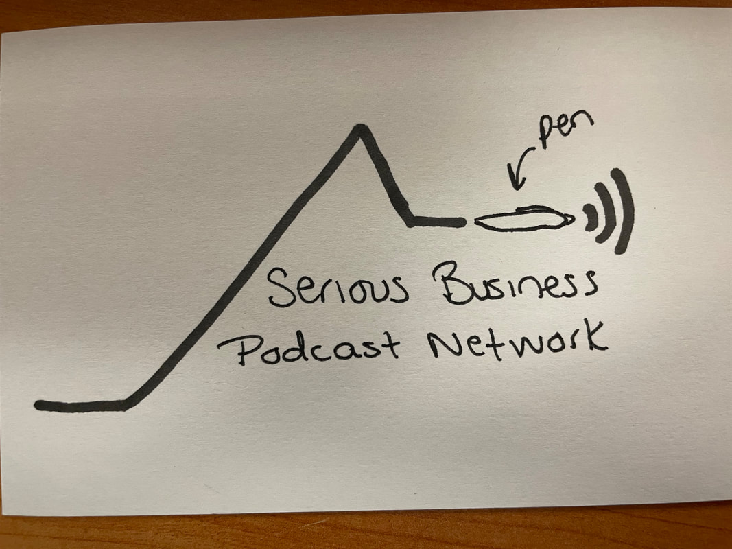
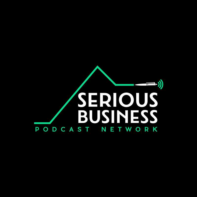
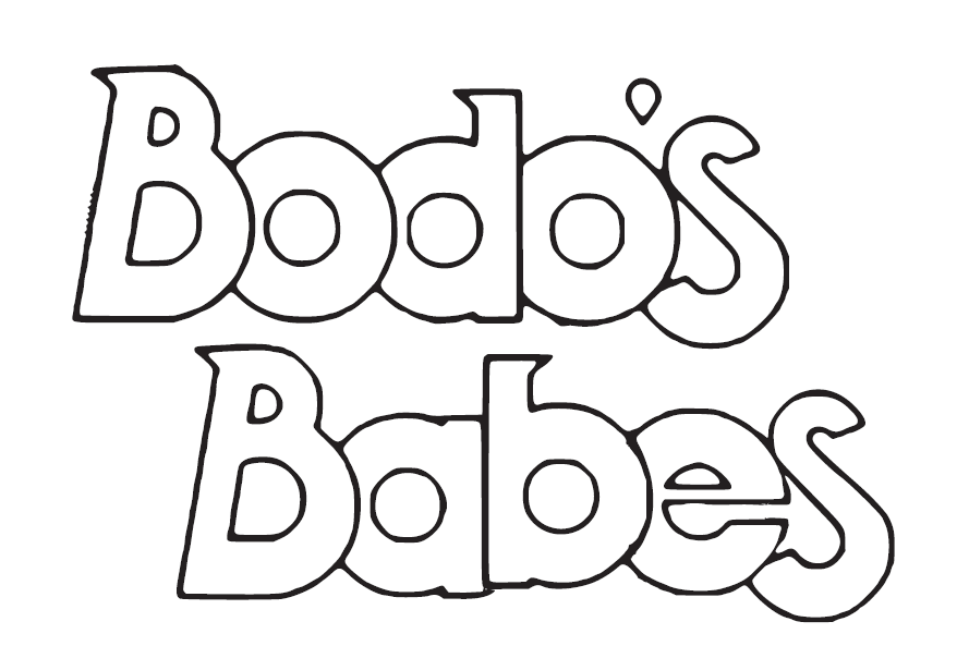
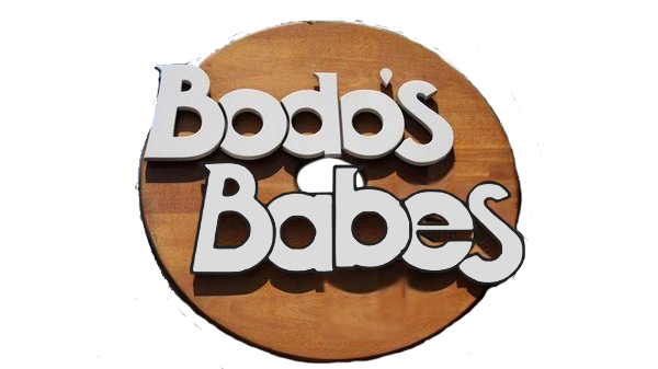
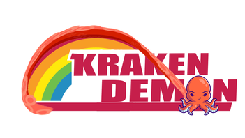
Branding for Serious Business Podcast Network
Our brand focuses on being "Serious about Storytelling", so I wanted to incorporate the line work of Freytag's pyramid -- the arc of plot structure -- in a way that also mimicked the way audio wav forms look, since our main focus is podcasting. For the colors, I was inspired by the default color scheme of Adobe Audition -- black background with green wav forms -- to further reinforce the connection to our audio medium.
Left image is a mockup I had drawn for inspiration, and the right is our finished logo.
Left image is a mockup I had drawn for inspiration, and the right is our finished logo.
|
|
Concept Design for Shakespeare production promotion posters:
Walking Shadow Shakespeare Project, Steps off Shakespeare
For Julius Caesar, the show concept centered around a punk rock aesthetic with a focus on how a single spark of social media comment can snowball into a revolution. Character portraits were individualized with quotes by or about that character but presented in the same font, color, and style, to highlight how each voice contributes to a collective movement.
For Twelfth Night, the emphasis of the campaign was to highlight the duality of Viola, with the shift in text format from the feminine left to the masculine right as well as the clear styling difference between the two sides.
For Twelfth Night, the emphasis of the campaign was to highlight the duality of Viola, with the shift in text format from the feminine left to the masculine right as well as the clear styling difference between the two sides.
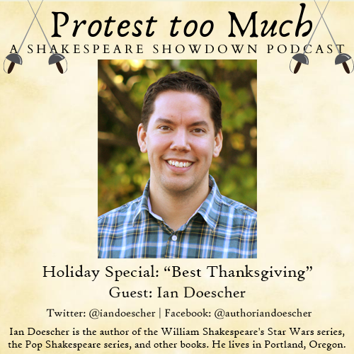
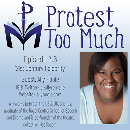
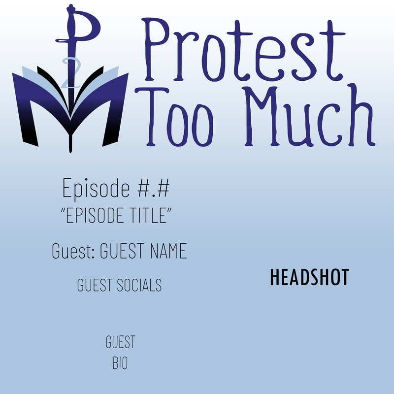
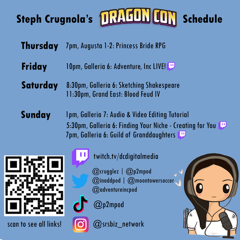
Promo Cards
For various podcasts, streams, and panels at conventions, I've designed cards for facebook, twitter, and instagram promotion. For the Protest too Much template, the goal is to deliver a standard set of information that stays consistent weekly so listeners are comfortable with how to read and engage with the information.
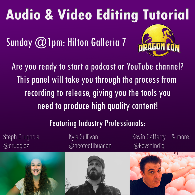
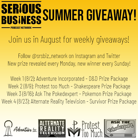
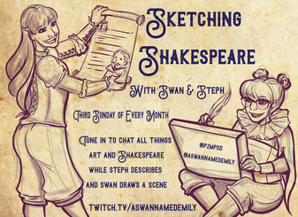
For others, the goal is effective delivery of as much detailed information as possible in a manageable format so that audiences have all of the information needed at one glance.
For others, the goal is effective delivery of as much detailed information as possible in a manageable format so that audiences have all of the information needed at one glance.
|

|
|
|
|
|
Photoshop
Below are a few samples of photoshop work I've done for friends, family, and podcasts
|
|
|
|
|